Mobile Marketing Strategies for Cannabis
The most valuable advertising real estate isn’t a billboard or a social feed, it’s your customer’s lock screen. Every cannabis brand is fighting for attention, but few have unlocked the one channel that cuts through the noise on mobile.
Start Course
Level: Intermediate
Videos: 2
Length: 20min
Mobile Marketing Strategies for Cannabis
Mobile Marketing Strategies for Cannabis

In an industry where compliance and targeting are non-negotiable, mobile marketing offers something no other strategy can: personal, permission-based communication that reaches consumers wherever they are. This guide explores why cannabis mobile marketing is the most powerful tool in your marketing arsenal—and how to use it strategically.
What Is Cannabis Mobile Marketing?
Cannabis mobile marketing is the practice of connecting with customers through mobile devices in targeted, permission-based, and legally compliant ways. It includes:

- Cannabis SMS marketing (text and multimedia messages)
- Cannabis mobile apps with loyalty programs, product catalogs, push notifications, and in-app messaging
- Geo-targeted mobile ads, including geofencing and location-based campaigns
- QR code campaigns on packaging, print, or POS materials
- Mobile wallet passes, digital coupons, and loyalty card replacements
- In-browser mobile display ads and retargeting
- Click-to-text or click-to-call ad extensions
- Mobile landing pages optimized for conversions
These channels provide unmatched reach and engagement—especially in a market where social and search ad restrictions block most other paid media.
Why Mobile Marketing Works for Cannabis Businesses
Reach Customers Where They Are
Smartphones are in everyone’s hands. Mobile marketing meets cannabis consumers on the go, at home, or in-store.
Stay Compliant
SMS and app marketing offer opt-in pathways that comply with cannabis advertising laws and data privacy standards.
Drive Measurable Results
Mobile marketing offers real-time data on opens, clicks, redemptions, and ROI—making marketing attribution far more trackable than traditional channels.
Build Loyalty and Repeat Visits
App-based rewards, text-only promotions, and geo-based alerts boost retention and order frequency.
Collect First-Party Data
In a post-cookie world, mobile marketing enables ethical first-party data capture through subscriber lists, app usage, and customer preferences.
Building a Cannabis Mobile Marketing Strategy
Here’s how to approach your dispensary marketing strategy:
Define your goals
Customer acquisition, retention, re-engagement, etc.
Choose your tools
SMS platforms, app builders, CRM systems
Segment your audience
Segment audiences into VIPs, new sign-ups, lapsed users
Plan the cadence
Avoid fatigue with thoughtful frequency
Stay compliant
Use opt-in language, age-gating, and data disclaimers
Measure everything
Opens, clicks, redemptions, ROAS
When marketing with mobile, success depends on segmentation, compliance, and timing.
Mobile Marketing Compliance Checklist
Cannabis mobile marketing lives or dies by its legal compliance. Make sure to:

- Follow TCPA and CTIA for SMS
- Avoid restricted words (e.g., “free weed”, potency claims)
- Only target 21+ users (with age gates and audience data)
- Honor opt-outs immediately (opt-out tools)
- Log consent and maintain audit trails
- Follow all state-specific cannabis advertising laws
How Mobile Marketing Compares to Other Channels
Cannabis digital marketing is the broader umbrella—it includes all channels that use digital technology to promote your brand. This spans websites, SEO, social media, email, video, and even desktop banner ads.
Mobile marketing, by contrast, is a specialized subset focused entirely on reaching users via smartphones and tablets. It emphasizes immediacy, location-awareness, and high engagement, often using tools like SMS, apps, and push notifications.
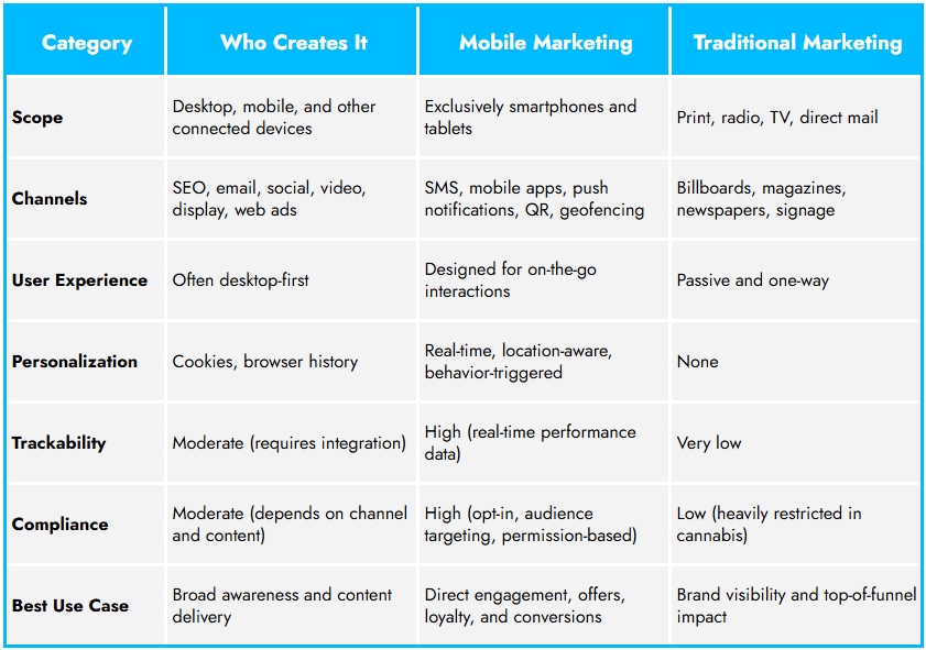
Mobile is the only marketing channel that checks every box: reach, ROI, and regulation.
Mobile Marketing Examples
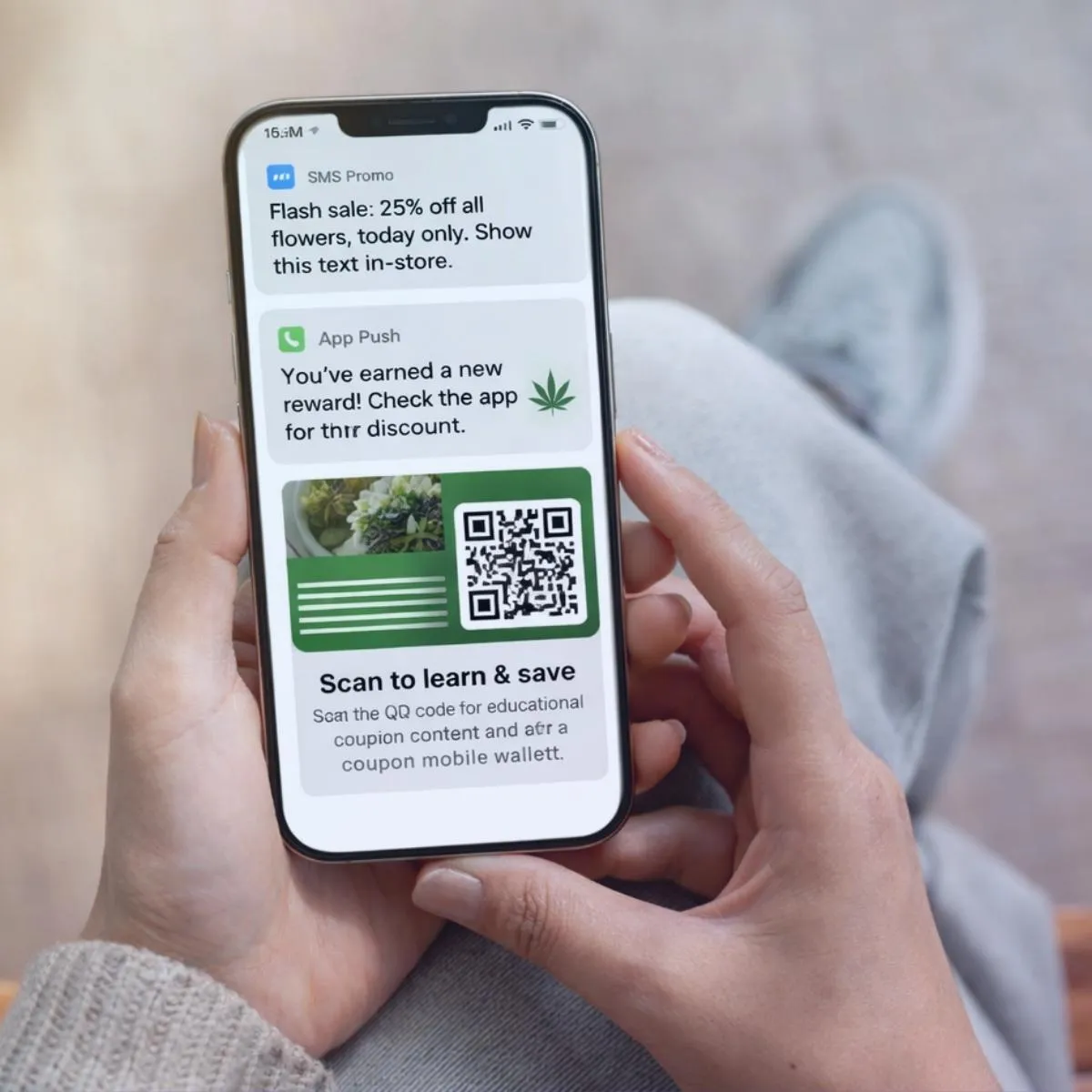
- SMS Promo: "Flash sale: 25% off all flowers, today only. Show this text in-store."
- App Push: "You’ve earned a new reward! Check the app for your discount." (push notifications)
- QR Code: On a product label that links to educational content and adds a coupon to the mobile wallet
Use these mobile marketing examples in combination to create automated, high-impact campaigns.
Choosing the Right Platform or Partner
When evaluating cannabis mobile marketing tools or agencies, look for:
- Compliance automation (age gates, opt-out tools)
- Robust analytics dashboards
- Segmentation and automation features
- Integration with POS and loyalty systems
- Experience in regulated industries
Planning Effective Mobile Marketing Campaigns

Strong mobile marketing campaigns start with clarity: What’s the goal—loyalty, sales, awareness? From there, align your messaging, cadence, and delivery tools. Use a blend of SMS, mobile app advertising, and in-app notifications to maximize impact. Always track engagement and optimize your mobile strategy in real time.
Metrics That Matter
Out of over 53 Cannabis KPIs, we recommend you track:

The percentage of users who agree to receive marketing communications.
Example: 200 opt-ins ÷ 1,000 users × 100 = 20%
The percentage of people who click your ad or link after seeing it.
Example: 150 clicks ÷ 5,000 impressions × 100 = 3%
The percentage of users who complete a desired action (purchase, signup, download, etc.).
Example: 75 conversions ÷ 1,500 visitors × 100 = 5%
The average amount of time it takes a recipient to open your message after it’s delivered.
Example: 600 total minutes ÷ 200 opens = 3 minutes average time to open
The percentage of users who engage with your content more than once.
Example: 120 repeat users ÷ 400 engaged users × 100 = 30%
The revenue generated for every dollar spent on advertising.
Example: $20,000 revenue ÷ $5,000 ad spend = 4.0 ROAS (4x)
What’s Next in Cannabis Mobile Marketing
AI-driven personalization
Wallet-based loyalty is replacing plastic cards
Enhanced app engagement metrics
Cross-channel attribution with mobile IDs
Real-time geofencing for hyperlocal ad
From Lock Screen to Loyalty

What used to be prime placement on a billboard is now a moment on a mobile screen—and that moment is everything. Mobile isn’t just where your audience is; it’s where they act, respond, and return. For cannabis brands, it’s not simply the most accessible channel—it’s the one most aligned with how people live, shop, and make decisions today. Cannabis Marketing has moved. If your strategy hasn’t followed, now’s the time.
Need help building your mobile marketing engine? Contact MediaJel to get started.
The strategies and insights shared in this course are based on MediaJel’s extensive experience in cannabis marketing and programmatic advertising. Results may vary based on individual implementation, market conditions, and compliance requirements.
Videos
Welcome to our Academy video series, where learning is simple, engaging, and accessible. Each video is crafted to help you grow your skills, gain new insights, and stay inspired. No matter your background or goals, there’s something here for everyone.
Resources
Browse through our collection of helpful resources designed to support your learning. You'll find useful links, materials, and tools to explore at your own pace. These resources are here to enhance your experience and keep you moving forward.
expand & engage retain & grow
From a dispensary launching in a local market to an established brand seeking to expand worldwide, programmatic can fuel your growth.
MediaJel is the industry’s digital marketing platform of choice for grow-focused brands and retailers like you.
Ready to accelerate?